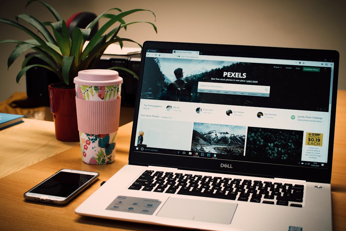
What Makes a Good Small Business Website in 2026
Your website is working for you or it’s working against you. There’s no neutral.
A good small business website doesn’t need to be fancy. It needs to be fast, clear, and built to turn visitors into customers. Here’s what actually matters in 2026 — and what you can safely ignore.
Fast Load Time — Under 2 Seconds
Speed is not optional. Google’s own data shows that 53% of mobile visitors leave a site that takes longer than 3 seconds to load. Under 2 seconds is where you want to be.
Every second your site takes to load costs you money. People don’t wait. They hit the back button and click on your competitor. Google also uses page speed as a ranking factor, so a slow site hurts you twice — you lose the visitor and you drop in search results.
The usual culprits are oversized images, cheap hosting, bloated code from website builders, and too many plugins. If you’re not sure how fast your site is, run it through Google PageSpeed Insights. It’s free and it tells you exactly what’s slowing things down.
Mobile-First Design
Over 70% of local searches happen on phones. That number has been climbing for years and it’s not going back down. If your site is hard to use on a phone, you’re invisible to the majority of your potential customers.
Mobile-first doesn’t mean your site just “works” on a phone. It means it’s designed for the phone experience first. Buttons are big enough to tap. Text is readable without zooming. Forms are short and easy to fill out with a thumb. The phone number is tappable — one touch and they’re calling you.
Pull up your site on your phone right now. Try to do the most important thing a customer would do — find your number, request a quote, or check your hours. If it takes more than a few seconds, you have a problem.

Clear Calls-to-Action on Every Page
Every page on your website should answer one question for the visitor: what do I do next?
Your phone number should be visible on every page, not buried in the footer. Your contact form should be easy to find — not hidden behind three clicks. A “Get a Quote” or “Schedule a Call” button should appear above the fold, meaning people see it without scrolling.
Too many small business websites look like digital brochures. They describe the business but never ask for the sale. You’re not running a museum. You’re running a business. Make it obvious how to hire you.
Trust Signals That Actually Matter
People are cautious about who they hire, especially online. Your website needs to prove you’re legitimate and good at what you do.
Reviews and testimonials are the most powerful trust signal you can have. Pull your best Google reviews onto your site. Include the customer’s name and the specific service. “Great work!” means nothing. “They replaced our roof in Chatham in two days and the crew was professional” — that sells.
Years in business matters. If you’ve been serving Cape Cod for 15 years, say it prominently. Experience builds trust fast.
Certifications and licenses should be visible. If you’re a licensed contractor, insured, bonded, or certified in anything relevant, put it on the page.
Real photos beat stock photos every time. People can spot a stock image instantly, and it makes your business feel generic. Use photos of your actual team, your real work, your real location. Authenticity is a competitive advantage.

SEO Basics Built Into Every Page
A beautiful website that nobody can find is a waste of money. Basic SEO needs to be part of the build, not an afterthought.
Every page needs a unique title tag that includes what you do and where you do it. “Cape Cod Plumbing | 24/7 Emergency Service in Barnstable County” is a title tag that works. “Home” is not.
Every page needs a meta description — the short text that shows up in Google search results. Keep it under 160 characters and make it compelling enough that someone wants to click.
Use a proper heading structure. One H1 per page that describes the page content. H2 subheadings to break up sections. This helps Google understand your content and helps visitors scan the page.
Work local keywords naturally into your content. Mention the towns you serve. Describe your services in the language your customers actually use. A professional website built with SEO in mind will handle all of this from the start.
Simple Navigation — 5 to 7 Pages Max
If someone has to think about how to find what they need, your navigation is too complicated.
Most small businesses need these pages: Home, About, Services (with sub-pages if you offer multiple services), a portfolio or gallery page, and Contact. That’s five or six pages. Maybe a blog if you’re doing content marketing. That’s it.
Every extra menu item adds friction. Drop-down menus with 20 options are overwhelming. A visitor should be able to get from your homepage to any page on your site in two clicks or less.
Put your most important pages in the main navigation. Put everything else in the footer. Keep it clean.
HTTPS Is Non-Negotiable
If your website URL starts with “http” instead of “https,” you have a security problem. Google Chrome literally flags non-secure sites with a “Not Secure” warning in the address bar. That warning kills trust instantly.
HTTPS encrypts the data between your website and your visitors. It protects contact form submissions, keeps browsing private, and signals to Google that your site is safe. Google has confirmed HTTPS as a ranking signal since 2014. In 2026, there is no excuse for not having it.
Most hosting providers offer free SSL certificates through Let’s Encrypt. If your site still doesn’t have HTTPS, call your host or your web developer today. It’s usually a quick fix.
What You DON’T Need
Half the stuff people think makes a website “good” actually makes it worse. Here’s what to skip.
Flashy animations and effects. They slow your site down and distract from the content. Nobody visits a roofing company’s website to watch a parallax scrolling animation.
Auto-playing music or video. Nothing makes someone close a tab faster. If you have a video, let the visitor choose to play it.
A homepage slider or carousel. Studies from the Nielsen Norman Group have shown that users rarely interact with sliders. The first slide gets seen, the rest are ignored. Use a strong static headline and image instead.
A chatbot that pops up in 2 seconds. Let people breathe. If you want a chat widget, set it to appear after 30 seconds of browsing or when someone reaches the bottom of a page. The instant pop-up just annoys people.
A redesign every year. A well-built site should last 3 to 5 years with regular content updates. If your site needs a complete overhaul every 12 months, it wasn’t built right the first time.
Get a Clear Picture of Where Your Site Stands
If your site is slow, hard to use on mobile, missing basic SEO, or not converting visitors into leads, it’s costing you customers every day.
We do free website reviews for small businesses. We’ll look at your site’s speed, mobile experience, SEO basics, and conversion setup — and tell you exactly what’s holding you back.
Request your free website review and find out what your site needs to start working harder for your business.